

Landing Page Design
A landing page is not a homepage. A homepage serves multiple intents. A landing page wins one intent:
one offer → one audience → one primary action.
This skill has two halves. Part A decides what the page says and how it is structured. Part B is the non negotiable visual system. Work through A before touching B.
Scope
Apply to all web UI work: landing pages, marketing sites, components, dashboards, prototypes, and design reviews. When a rule here conflicts with a framework default, this file wins. When the user's explicit prompt conflicts with a rule, the user wins.
Companion skill. For upgrading an existing site rather than building a new one, use redesign-existing-projects (github.com/elayadesign/redesign-skill). It diagnoses generic patterns and defers to this file for every concrete value.
PART A — Strategy and structure
A1. Intake
Gather these before designing or writing. Ask only for what is missing, and ask in one batch rather than one question at a time.
Purpose
- What is the ONE primary action? (trial, demo, buy, waitlist, download)
- What is the offer, exactly what do they get?
- What counts as a conversion? (click, signup, purchase)
Audience and context
- Who is the ICP?
- What problem are they trying to solve?
- Top three objections, meaning why they do not convert today
- Traffic source: ads, search, social, email
- What do visitors already know when they land?
Proof and assets
- Proof points: logos, testimonials, numbers, case studies
- Screenshots, demo video, product GIFs
- Guarantees, refund terms, cancellation terms
Constraints
- Brand voice: casual or professional
- Design direction: minimal editorial, playful 3D, glass UI
- Mobile priority?
If the user cannot answer, make a reasonable assumption, state it in one line, and continue. Do not stall the build.
A2. Page structure
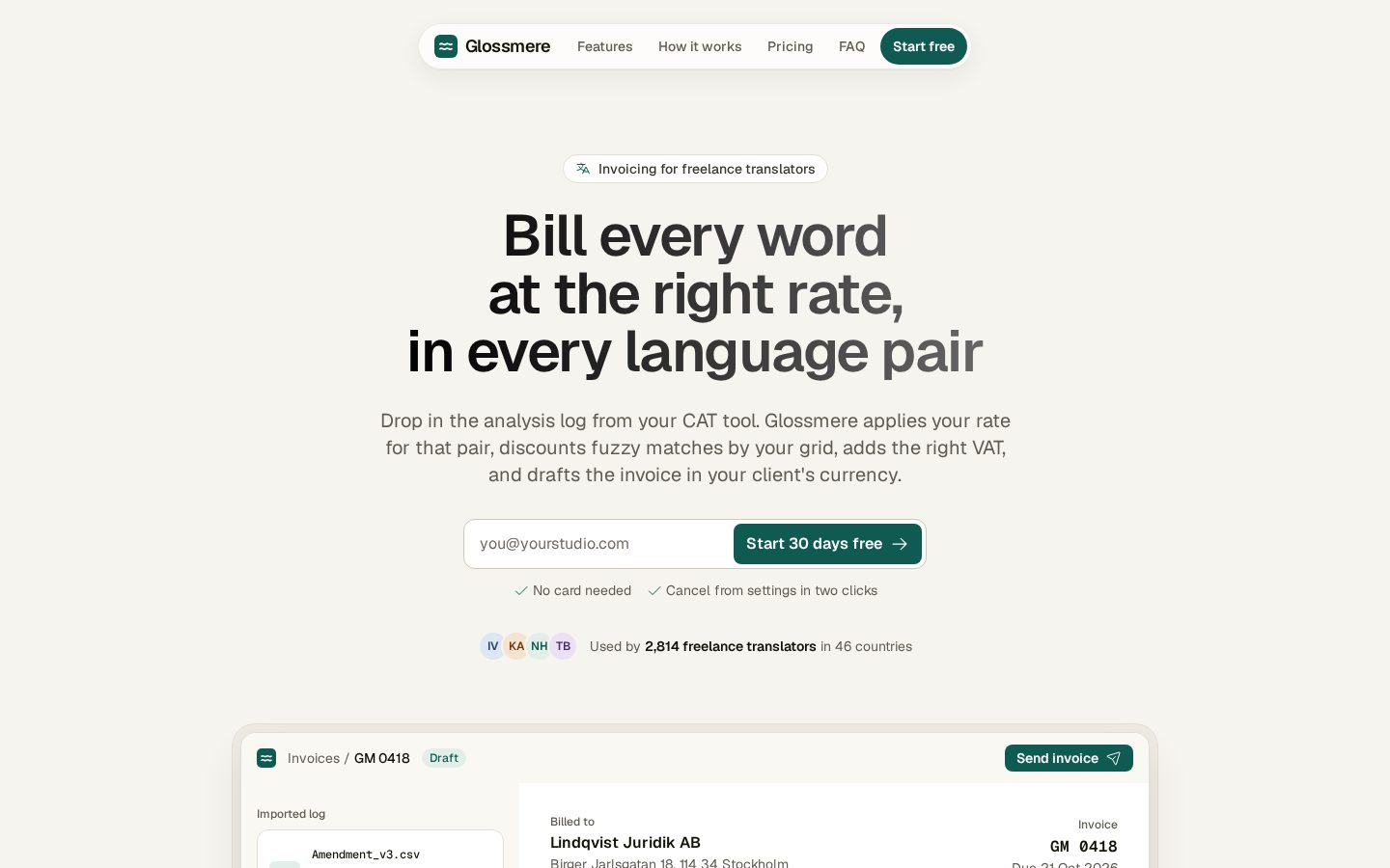
Above the fold (required)
- Headline, outcome plus audience
- Subheadline, clarifies how and adds specificity
- Primary CTA, clear verb plus what they get
- One proof signal, logo strip, stat, or short testimonial
- Hero visual, product screenshot or video, or a strong illustration
Mid page (the argument) 6. Problem to solution, one section 7. Benefits, three to five, outcome driven 8. How it works, three steps 9. Social proof, testimonials or a case study
Bottom (objection handling) 10. FAQ, six to twelve questions 11. Risk reversal, trial, cancel anytime, guarantee 12. Final CTA, identical to the top
Include the mandatory tagline reveal section from B11 somewhere in the mid page argument, typically right after the hero or after benefits.
A3. Layout selection
Pick one and say why.
| Type | Use when |
|---|---|
| A. Classic hero plus sections | The product is understandable from a hero screenshot. Most common. |
| B. Long form story | You need to educate and overcome skepticism. |
| C. Minimal conversion page | High intent traffic (email to known users), or a short offer like a download or waitlist. |
| D. Comparison page | Search intent includes alternatives ("X vs Y", "best for"). Usually paired with SEO pages. |
A4. Conversion rules
Match message to source. If traffic comes from ads, mirror the ad headline in the hero and keep the same promise and visual tone.
Make the next step obvious. One primary CTA. Never place competing CTAs above the fold.
Write benefit first. Features are what it does. Benefits are what that means for them.
Be specific.
- ❌ "Save time and streamline"
- ✅ "Cut your weekly reporting from 4 hours to 15 minutes"
Reduce risk. Pick at least one: free trial, free plan, no credit card, cancel anytime, money back guarantee.
Treat objections as a section, not a footnote. Move the FAQ earlier for high friction offers. Put proof directly beside the claim it supports.
A5. Copywriting
Headline formulas
- "{Outcome} without {pain}"
- "The {category} for {audience}"
- "Ship {result} in {time}"
Subheadline. One or two sentences. Clarify what it is and who it is for.
CTA. Verb plus what they get. Never "Learn more" or "Submit". Use "Start free trial", "Book a demo", "Get the checklist".
Benefit bullets. Bold benefit, then the proof or detail. Example: Faster iteration — generate three layout variants in one click.
Note: the copy rules in B1 still apply. No hyphens inside sentences, no orphaned words.
A6. Build order
Work section by section, in this order:
- Hero
- Benefits
- How it works
- Proof
- FAQ
- Final CTA
Never rebuild the whole page on each iteration. Section by section keeps control and keeps diffs reviewable.
A7. SEO and AEO
Do not index ad only campaign pages or highly time bound offers. Use noindex or keep them behind a non indexed path.
Do index evergreen offers and pages where search intent matches the promise. Add a clear title and meta description, internal links from the homepage and feature pages, and the FAQ in plain question and answer form for AEO. Add FAQ schema if appropriate.
A8. Pitfalls
- Too many CTAs above the fold
- Vague value prop: "streamline", "optimize"
- A large feature list with no outcomes
- Proof buried at the bottom
- Mobile layout that breaks readability
- No clear next step
PART B — Visual system
Every visual value must resolve through these rules instead of being invented ad hoc.
B1. Typography
Fonts
Use: Geist, Manrope, Geist Mono, Poppins.
Never use: Inter, Roboto, Arial, Open Sans, Helvetica.
Never use italic fonts anywhere in the interface.
One typeface per site. Do not pair two fonts unless the prompt explicitly asks for it. Geist Mono is allowed alongside a primary font only for code, data, or numeric UI where a monospace is functionally required.
Never use ultra bold weights (900 / black). Cap at semibold or bold.
Copy rules
No hyphens in text. Do not use - inside body copy, headings, or labels. Rewrite the phrase instead.
No orphaned words. A single word must never sit alone on the last line. Apply text-wrap: balance for headings and text-wrap: pretty for body copy.
Type scale
Always resolve font sizes to Tailwind's default type scale. Never leave arbitrary values in place, including text-[19px], font-size: 22px, or 1.4rem.
If an existing size does not land exactly on a step, snap it to the closest step below, taking both the size and its paired line height.
| Class | Size | Line height |
|---|---|---|
text-xs |
12px (0.75rem) | 16px |
text-sm |
14px (0.875rem) | 20px |
text-base |
16px (1rem) | 24px |
text-lg |
18px (1.125rem) | 28px |
text-xl |
20px (1.25rem) | 28px |
text-2xl |
24px (1.5rem) | 32px |
text-3xl |
30px (1.875rem) | 36px |
text-4xl |
36px (2.25rem) | 40px |
text-5xl |
48px (3rem) | 1 |
text-6xl |
60px (3.75rem) | 1 |
text-7xl |
72px (4.5rem) | 1 |
text-8xl |
96px (6rem) | 1 |
text-9xl |
128px (8rem) | 1 |
Do not combine scale snapping with independently set custom line heights elsewhere in an audit. Tracking and line height may only be adjusted within the value the matched step already provides, so the two rules never fight each other.
Text styles
Every piece of text uses one of these named styles. Never style text with a loose size and weight. Use the names exactly as written, including capitalization.
| Style | Scale step | Size / line height | Weight |
|---|---|---|---|
| Heading 1 | text-6xl |
60 / 60 | Semibold |
| Heading 2 | text-5xl |
48 / 48 | Semibold |
| Heading 3 | text-4xl |
36 / 40 | Semibold |
| Heading 4 | text-3xl |
30 / 36 | Semibold |
| Heading 5 | text-2xl |
24 / 32 | Semibold |
| Heading 6 | text-xl |
20 / 28 | Semibold |
| Title 1 | text-xl |
20 / 28 | Medium |
| Title 2 | text-lg |
18 / 28 | Medium |
| Title 3 | text-base |
16 / 24 | Medium |
| Title 4 | text-sm |
14 / 20 | Medium |
| Title 5 | text-xs |
12 / 16 | Medium |
| Body 1 | text-base |
16 / 24 | Semibold |
| Body 2 | text-base |
16 / 24 | Medium |
| Body 3 | text-base |
16 / 24 | Regular |
| Body 4 | text-sm |
14 / 20 | Semibold |
| Body 5 | text-sm |
14 / 20 | Medium |
| Body 6 | text-sm |
14 / 20 | Regular |
| Button-lg | text-lg |
18 / 28 | Semibold |
| Button-md | text-base |
16 / 24 | Semibold |
| Button-sm | text-sm |
14 / 20 | Semibold |
| Button-Xsm | text-xs |
12 / 16 | Semibold |
| Caption 1 | text-sm |
14 / 20 | Medium |
| Caption 2 | text-sm |
14 / 20 | Regular |
| Caption 3 | text-xs |
12 / 16 | Semibold |
| Caption 4 | text-xs |
12 / 16 | Medium |
| Caption 5 | text-xs |
12 / 16 | Regular |
How the groups work:
- Heading for page and section headings, largest to smallest. Heading 1 is the hero.
- Title for card titles, list item titles, labels that lead a block, and nav items.
- Body for running text. Within each size, 1 is the strongest weight and the last is regular.
- Button for text inside buttons only. Main buttons use Button-md, small header buttons use Button-sm.
- Caption for metadata, helper text, badges, timestamps, and fine print.
The sizes come from the type scale above, so a style never introduces an off scale value. If a project needs a new style, add the next number in its group (for example Body 7) built from a scale step, rather than inventing a new name.
In code, define each style once as a reusable class or token with the same name in kebab case (heading-1, body-4, button-md, caption-2) and apply that, instead of repeating size and weight utilities on every element.
B2. Spacing
Only these values. Nothing between them, nothing outside them.
| Token | Value |
|---|---|
| Spacing-0 | 0 |
| Spacing-25 | 2px |
| Spacing-50 | 4px |
| Spacing-75 | 8px |
| Spacing-100 | 12px |
| Spacing-200 | 16px |
| Spacing-300 | 24px |
| Spacing-400 | 32px |
| Spacing-500 | 40px |
| Spacing-600 | 48px |
| Spacing-700 | 64px |
| Spacing-800 | 80px |
| Spacing-900 | 96px |
Main buttons: 8px vertical padding, 12px horizontal padding.
B3. Corner radius
Only use Tailwind's radius values.
Nested radius formula. When a shape sits inside another shape and the gap between them is less than 32px:
inner radius = outer radius − gapApply this only when the result is greater than 2. Below that, leave the inner shape square or unchanged.
Example: an outer card at rounded-2xl (16px) with 8px of internal padding gives an inner element an 8px radius (rounded-lg).
B4. Borders and backgrounds
- Never apply a border to only one side of a card. Borders go all the way around or not at all.
- Never use gradients in backgrounds. Backgrounds are flat.
Dark mode background colors
Use only these:
#000000 · #181818 · #1F1F1F · #272727 · #313131 · #131209
B5. Hero section
Heading color
- Dark theme: left to right gradient on the heading text,
#FFFFFF→#9B9B9B. - Light theme: left to right gradient on the heading text,
#000000→#666666.
This is the one place gradients are used, and only on text, never on the background.
Layout
- Heading and subheading both get a max width of 680px.
- Read the heading copy and insert line breaks at meaningful points.
- Never break a line in a way that cuts a phrase awkwardly or makes the sentence harder to read. Break where the thought breaks.
B6. Icons
Use: Phosphor, Solar, or Iconamoon.
Never use: Material Icons, Material Symbols.
B7. Motion
Motion should feel weighted and decelerate into place. Never ship a browser default curve (ease, linear, ease-in-out).
Base curve: ease-[cubic-bezier(0.22,1,0.36,1)] with duration-500 for layout and position changes. Color and opacity shifts on hover may use duration-300, never shorter than 200ms.
Animate only transform and opacity. Never animate top, left, width, or height.
Respect prefers-reduced-motion: replace movement with a plain opacity change.
Navigation
Resting state. A compact bar that floats off the top edge rather than sitting flush against it, centered and sized to its content. It uses a translucent surface over a background blur so page content stays faintly visible behind it. Spacing comes from B2, radius from B3.
Menu toggle. The open and close icon transforms between its two states instead of swapping instantly. Use an icon from B6 or draw the lines yourself; either way the change is animated with the base curve.
Mobile menu. Opens as a full height panel, not a small dropdown. The panel background uses the theme's base surface at high opacity with a strong blur.
Link entrance. Links inside the open menu arrive one after another in reading order, each moving up a short distance (Spacing-300, 24px) while fading in. Step each item 60ms after the previous one and cap the total sequence at 400ms so long menus never feel slow.
Scroll reveals
Sections entering the viewport rise a short distance (Spacing-400, 32px) and fade from 0 to full opacity over 600 to 800ms on the base curve. Reveal each section once; do not replay on scroll back up.
Trigger reveals with IntersectionObserver or Framer Motion's whileInView. Never attach work to an unthrottled window.addEventListener('scroll'), since it runs on every frame and drags down mobile performance.
B8. Content realism
Every piece of sample content should read like it came from a real product with real users.
- Write the copy. No placeholder Latin, no "Your headline here". Draft real sentences in the product's voice.
- People. Give testimonials and team members full, specific names that fit the product's audience and region. Never reuse one face for two people.
- Brands and logos. Invent names that sound like they belong in the product's industry. A logistics tool's customers sound like logistics companies, not generic tech startups.
- Never invent facts. On a real product's page, prices, guarantees, statistics, customer counts, testimonials, and logos must come from the user or a real source. When a fact is missing, use a clearly marked placeholder such as
{{price}}or{{testimonial}}instead of making one up. - Sample numbers. In fictional demos and prototypes (where the invented names and brands above are fine), avoid suspiciously round figures. Pricing should look like real pricing, metrics should carry a decimal or an odd final digit, and dates across a list should vary.
- Banned filler words. Do not write "revolutionize", "supercharge", "cutting edge", "effortless", "transform your workflow", "take it to the next level", "harness the power", or "world class". Say what the product does in plain terms instead.
- Sentence case for headings and buttons.
- System messages. Confirmations are calm and specific ("Invoice sent to Dana"). Errors say what failed and what to do next ("Upload failed. The file is over 20 MB."). No cute interjections, no exclamation marks.
B9. States
Every interactive element ships with its full state set:
- Hover — background shift, slight scale, or translate
- Active —
scale(0.98)ortranslateY(1px)for physical feedback - Focus — a visible focus ring. Accessibility requirement, not optional.
- Loading — skeleton loaders shaped like the real layout, not circular spinners
- Empty — a composed "getting started" view, never a blank panel
- Error — inline and specific. Never
window.alert().
No dead links. A button pointing at # is either linked or visually disabled. The current page must be indicated in the navigation.
B10. Ship requirements
Things that get forgotten and make a page feel unfinished:
- Privacy policy and terms links in the footer
- A custom, branded 404
- Client side form validation for email format and required fields
- A skip to content link for keyboard users
- Cookie consent where the jurisdiction requires it
- A branded favicon
<title>, meta description,og:image, and social sharing tags- Alt text on every meaningful image
- Semantic HTML:
<nav>,<main>,<article>,<aside>,<section> - A way back from every page
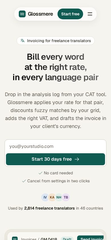
- A check at 390px wide: no horizontal overflow, buttons keep their text inside, and the primary action is visible in the first screen
B11. Tagline reveal section (mandatory)
Every landing page includes one large type section stating the core benefit or tagline, separate from the hero. It sits further down the page as its own moment, not stacked directly under the hero.
Copy
- Minimum two lines of text.
- A benefit statement or tagline, written in the voice of A5, not a generic section heading.
Typography
- Use Heading 3 to Heading 1 from the B1 text styles, depending on line count.
- Max width capped like the hero, so lines break at meaningful points per B5.
Animation
- Text starts in a subtle, muted tone, roughly 25 to 35% opacity of the theme's base text color.
- As the section scrolls into view, each word transitions individually from that muted tone to the full text color, in reading order.
- Words activate one at a time as they cross a trigger line, not the entire block flipping at once. The transition uses the base curve from B7, never a linear fade.
- Implement with
IntersectionObserverper word, or a single scroll listener throttled throughrequestAnimationFrame. Never an unthrottledwindow.addEventListener('scroll'), per B7. - Under
prefers-reduced-motion, show the final text at full color right away, with no word by word animation.
Output format
When generating a landing page from scratch, return these in order before writing code:
- Page outline — sections and their order
- Hero copy — headline, subheadline, CTA, proof line
- Benefits — three to five outcome driven bullets
- How it works — three steps
- FAQ — six to twelve questions and answers
- SEO / AEO — index or noindex recommendation, plus title and meta if indexed
- Layout recommendation — A, B, C, or D, and why
Then build section by section per A6.
Quick checklist
Strategy
- One offer, one audience, one primary action
- No competing CTAs above the fold
- Specific numbers instead of vague verbs
- At least one risk reversal
- Proof sits next to the claim it supports
- Layout type chosen deliberately
Visual
- Single approved typeface, no italics, no ultra bold
- No hyphens in copy, no orphaned words
- Every font size lands on a Tailwind scale step
- Every text element uses a named text style (Heading, Title, Body, Button, Caption)
- Every spacing value comes from the spacing table
- Nested radii follow the formula
- No single sided card borders, no background gradients
- Hero heading and subheading capped at 680px with meaningful line breaks
- Icons from Phosphor, Solar, or Iconamoon
- Every transition uses the B7 base curve, scroll reveals use IntersectionObserver
- Tagline reveal section present, minimum two lines, words activate one at a time on scroll
- No invented prices, stats, or testimonials; missing facts use marked placeholders
- Checked at 390px with no overflow
Content and ship
- Real draft copy, believable names and numbers, no banned filler words
- Hover, active, focus, loading, empty, and error states all present
- No dead links, current nav item indicated
- 404, legal links, form validation, favicon, meta tags, alt text
Credits
The no invented facts rule and reduced motion support for the tagline reveal were suggested by @allen-baler in #1.
Parts of this skill were adapted from taste-skill by Leon Lin (@LexnLin), MIT licensed. Its redesign audit structure, content realism checks, and motion and navigation ideas informed the matching sections here, which have since been rewritten.
<details> <summary>taste-skill license</summary>MIT License
Copyright (c) 2026 Leonxlnx
Permission is hereby granted, free of charge, to any person obtaining a copy
of this software and associated documentation files (the "Software"), to deal
in the Software without restriction, including without limitation the rights
to use, copy, modify, merge, publish, distribute, sublicense, and/or sell
copies of the Software, and to permit persons to whom the Software is
furnished to do so, subject to the following conditions:
The above copyright notice and this permission notice shall be included in all
copies or substantial portions of the Software.
THE SOFTWARE IS PROVIDED "AS IS", WITHOUT WARRANTY OF ANY KIND, EXPRESS OR
IMPLIED, INCLUDING BUT NOT LIMITED TO THE WARRANTIES OF MERCHANTABILITY,
FITNESS FOR A PARTICULAR PURPOSE AND NONINFRINGEMENT. IN NO EVENT SHALL THE
AUTHORS OR COPYRIGHT HOLDERS BE LIABLE FOR ANY CLAIM, DAMAGES OR OTHER
LIABILITY, WHETHER IN AN ACTION OF CONTRACT, TORT OR OTHERWISE, ARISING FROM,
OUT OF OR IN CONNECTION WITH THE SOFTWARE OR THE USE OR OTHER DEALINGS IN THE
SOFTWARE.