

Documents and presentations
Read this for reports, briefs, plans, explainers, comparisons, and slide-like artifacts.
Documents
Design around the reader's decision or understanding, not around a generic page outline. The opening should orient quickly: what this is, why it matters, and what deserves attention. Follow with evidence, structure, and detail in the order the reader needs them.
- Keep prose measures readable and let tables, timelines, code, and diagrams use wider regions.
- Use headings, labels, numbering, dividers, and callouts only when they express genuine hierarchy or sequence.
- For plans, stay close to the user's language and ambition. Clarify ownership, order, dependencies, risks, and completion conditions without inventing a larger program.
- For reports, distinguish observation, interpretation, recommendation, and uncertainty.
- For comparisons, keep like-for-like attributes aligned so the eye can compare without remembering.
- For print-oriented work, add sensible print styles and avoid interactions that hide essential content.
Most operational documents want a workmanlike register. They still deserve intentional typography, spacing, and color, but rarely need a giant hero or ornamental dashboard furniture.
Presentations
A presentation is paced, not merely paginated. Give each screen one job and one dominant idea.
- Establish a visual rhythm across slides, then break it only for emphasis.
- Keep essential information visible without hover.
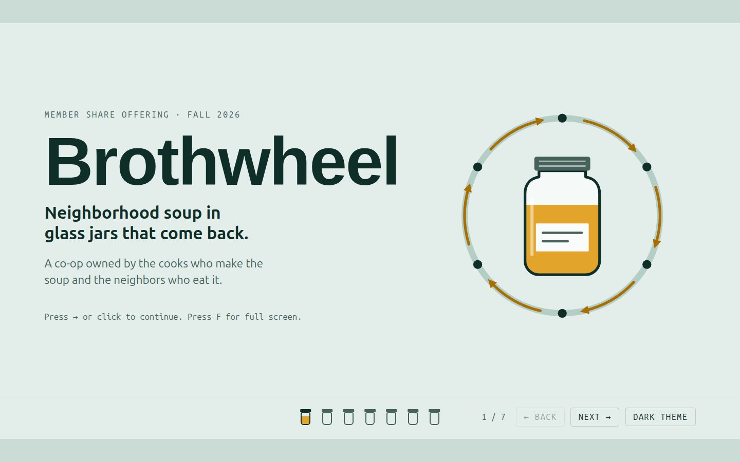
- If the file behaves like a deck, support keyboard navigation, clear progress, and direct slide links when practical.
- Use builds and transitions to control explanation order, not to decorate every change.
- Ensure a useful narrow-screen or scrolling fallback when the fixed stage cannot fit.
When a request blends a document and a deck, prefer the reading mode the audience will actually use rather than building two half-working experiences.