
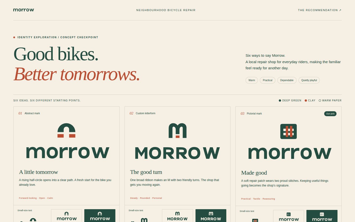

Mark Types — What to Choose and When
Choosing the type of mark is a strategic decision that comes before drawing. Each type has different
strengths, costs and failure modes. Library examples can be pulled with
python3 scripts/search_library.py --type <type> --exemplary --format paths.
Contents
- Overview table
- Wordmark (logotype)
- Lettermark / monogram
- Letterform (single-letter symbol)
- Pictorial mark
- Abstract mark
- Negative-space mark
- Mascot / character
- Emblem / badge
- Combination mark & lockups
- Pictograms, logo systems, dynamic marks, patterns
- Decision guide
1. Overview table
| Type | What it is | Best when | Watch out for |
|---|---|---|---|
| Wordmark | Name set in distinctive type only | Name is short, distinctive, new (needs to be learned); limited media budget | Generic if type is stock; long names shrink badly |
| Lettermark / monogram | 2+ initials combined | Long or hard-to-say names; heritage/fashion/institutions | Woven initials carry little meaning; needs lots of exposure |
| Letterform | One initial as a symbol | App icons, tech, finance; need a compact avatar | Many brands share the same letter; needs a twist |
| Pictorial | Recognisable object/animal | Name or story has a vivid image; global/wordless recognition | Literalness; clichés; too much detail |
| Abstract | Non-representational form | Conceptual positioning (speed, connection); diversified companies | Meaningless without exposure/story |
| Negative space | Two silhouettes sharing an edge | A clever, conceptually linked pair exists | Hardest to do; forced results; ambiguity |
| Mascot | Character with personality | Family, food, games, community brands | Complexity, dating, poor small-size performance |
| Emblem | Type locked inside a badge/seal | Institutions, clubs, craft, heritage, sports | Illegible when small; inflexible |
| Combination | Symbol + wordmark lockup | Most new brands (symbol can later stand alone) | Two weak halves ≠ one strong mark |
Library data point: of the 233 brands in the bundled library that ship both a full logo and a standalone icon, about 9 in 10 full logos are wide horizontal lockups (aspect ratio above 2.5 : 1), while about 3 in 4 icons are near-square (0.8–1.25 : 1). Designing the symbol and the lockup as a pair from day one is the norm, not the exception.
2. Wordmark (logotype)
The brand name alone, in type with strong, defined character.
- Advantage: sidesteps the recognition problem — the name is always visible, so there is no symbol to learn.
- Disadvantage: if not handled skilfully, it's generic and has little mnemonic value.
- Make it ownable: customise letterforms (cuts, joins, terminals, a distinctive
a/g/e), build a ligature, substitute one letter with a meaningful sign, hide a shape in the counters or between letters, adjust weight contrast, or draw it from scratch. If using a neutral sans, some device (ligature, trick, hidden sign) is necessary to make it memorable. - Extreme minimal wordmarks — very clean, near-neutral type — can signal sophistication, useful in B2B and premium sectors crowded by loud identities.
- Case matters: lowercase reads approachable and contemporary; uppercase reads stable, institutional, monumental; title case reads conventional. Legibility depends on the typeface — test both.
- Spoken sound: letter rhythm should echo how the word sounds; a playful shift on the baseline can make the viewer "hear" the word.
- Length: long names become thin, wide strips that shrink poorly — consider a stacked version or a companion monogram/letterform for small sizes.
3. Lettermark / monogram
Two or more initials combined into one mark.
- Advantage: solves long names and legibility in tight spaces (a quarter-page ad, an app icon).
- Disadvantage: generic initials treated in clever ways can look better on towels than on a business card; woven initials have little inherent meaning and depend on large-scale exposure to be recognised.
- Letter chemistry: letters with rich structure (
a,s,w,g,k,R,M,W) interlock in more interesting ways; simple letters (i,l,I) offer little. Look for shared strokes, mirrored shapes, and counters that can nest. - Numbers pair well with letters when the name includes one (a
Dand a4share curves and diagonals). - Traditionally strong in fashion, luxury, publishing, institutions — where a person's or house's name is the brand.
4. Letterform (single-letter symbol)
One initial treated as a symbol that conceptually, stylistically or metaphorically carries the brand.
- Carries less information than pictorial marks, so it's more neutral and often more timeless. Favoured by finance and technology.
- Many brands share the same initial — the concept must live in the treatment: a letter that is also an arrow, a path, a fold, a spark, a bracket, a container, a person.
- Excellent as app icon / favicon / avatar; pair with a wordmark for the full lockup.
5. Pictorial mark
A meaningful, recognisable icon — object, animal, plant — as the primary identifier.
- The most widespread and one of the most effective forms; ideally recognisable without the name.
- Can depict the brand directly (name = object) or metaphorically (an animal's qualities = brand's qualities).
- Because the image is visually dense and characterful, pair it with neutral typography to create contrast and avoid overload.
- Work in silhouette first: an object's most characteristic view (front view of an apple, side view of a bird) is the one that can't be mistaken for anything else.
- Reduce to geometry: a leaf is two quarter circles; a bird is a few arcs. Geometric reduction is what makes pictorial marks feel designed rather than clip-art.
6. Abstract mark
A form that represents an idea in a suggestive, subjective way — a phenomenon rather than an object.
- Useful when the business is diversified, the name gives no visual clue, or the brand wants a conceptual, ownable shape.
- Some phenomena map naturally to form (connection → linking shapes; speed → tapering sweep; growth → ascending/expanding forms; openness → broken circle). Others ("reliability", "quality") have no natural sign, so meaning is assigned through story and repetition.
- An abstract mark is only meaningful after heavy exposure. It works for organisations with the reach to teach it; it's risky for a small business with little media presence.
- Avoid unintended connotations (political, ethnic, religious, sexual) — broad institutions especially need marks with no negative associations.
7. Negative-space mark
Uses the surrounding space as part of the concept: figure and ground both carry meaning.
- The strongest versions merge two strongly recognisable silhouettes that are conceptually related — one positive, one negative — so the whole becomes more than its parts (a Gestalt effect).
- They are rare and arguably the hardest marks to create; only simple elements with distinctive silhouettes combine cleanly.
- Also usable at smaller scale: an arrow hidden between two letters, a shape formed inside a counter.
- Check readability both ways: some people see only one figure. The hidden figure should be a bonus, not a requirement for understanding.
- In SVG, build with
fill-rule="evenodd"or subtracted compound paths (seesvg-construction.md).
8. Mascot / character
A character with a face and personality.
- Creates warmth and story; strong for food, family, games, community and education brands.
- Risks: detail, dating, and poor performance at small sizes. Provide a simplified head/icon version.
- Keep the construction geometric and the expression clear at a distance; test at 24 px.
9. Emblem / badge
Text integrated inside a seal, crest, shield or enclosure — the parts cannot be separated.
- Conveys tradition, authority, membership, craft. Common for universities, sports clubs, breweries, public bodies.
- Loses legibility quickly at small sizes; plan a simplified inner symbol for favicons and avatars.
- Containment also solves practical problems: a box behind a wordmark can give presence in cluttered environments.
10. Combination mark & lockups
A symbol and a wordmark designed to work together and, eventually, apart.
- The most common and flexible solution. Over time a well-exposed symbol can stand alone.
- The symbol and type should share DNA (stroke weight, corner radius, angles, x-height relationships) without duplicating each other. Ornate symbol → plain type; bold symbol → lighter type; aim for complement, not contrast for its own sake.
- Provide multiple lockups: horizontal (symbol left of name), stacked/vertical (symbol above name), symbol-only, wordmark-only, and optionally with tagline. Lock the relative sizes and spacing once approved.
- Symbol-to-type size: optically, the symbol usually spans the cap height to about 1.5–2.5× the cap height in horizontal lockups; verify by eye, not formula.
11. Pictograms, logo systems, dynamic marks, patterns
- Pictograms: pictures standing for a word or idea, understandable across languages. Built from the most primary elements (line, circle, square, triangle). Useful as companion icon sets for an identity.
- Logo systems / sub-brands: a parent symbol as the primary identifier with sub-brands distinguished by colour, naming, or a shared visual language. Consistency and repetition of key elements hold the family together. One of the most complex tasks: requires problem-solving and a strong sense of balance.
- Dynamic / changeable marks: a consistent core (letterforms, grid, frame) with changing elements (colour, pattern, inner image, typeface from an approved set). Keeps a system fresh and lets different users express themselves while remaining recognisable. Define the rules as carefully as the mark.
- Patterns: complement the mark without duplicating it; derive from components of the mark where possible;
must scale from a business card to an aircraft. See
identity-system.md.
12. Decision guide
Answer in order; the first strong "yes" usually wins.
- Is the name short (≤ ~8 letters), distinctive, and not yet known? → Wordmark or wordmark-led combination.
- Is the name long, multi-word, or hard to pronounce? → Lettermark/monogram or letterform + wordmark.
- Does the name or story contain a vivid, ownable image? → Pictorial (or pictorial combination).
- Is there a strong phenomenon/idea but no object? → Abstract (only if exposure will be high).
- Will the mark mostly live as an app icon, favicon or avatar? → Letterform or compact symbol first, then the lockup.
- Heritage, membership, authority or craft positioning? → Emblem, with a simplified inner symbol.
- Warmth, family, play? → Mascot or friendly pictorial, with a simplified head version.
- Parent brand with many children? → Logo system with a fixed core.
When in doubt, explore three different types in the first round (e.g. a wordmark, a letterform, and a pictorial/abstract symbol) so the choice is made by comparing real options.