

Presentation, Feedback & Delivery
How to present concepts so they are judged on the right criteria, how to handle feedback and committees, and what to deliver at the end. Also covers the working relationship (fees, spec work, rights) for users who are designers.
Contents
- Presentation rounds
- Structure of a concept presentation
- Talking about concepts
- Feedback, committees and decision-makers
- Final deliverables
- The working relationship (for designer users)
1. Presentation rounds
A typical project has three presentations:
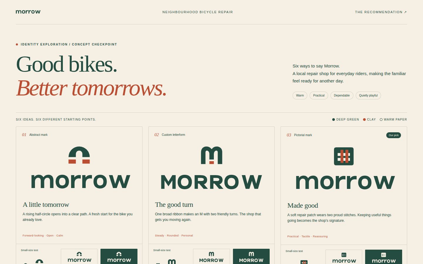
- Concepts (the checkpoint) — three distinct directions at ~80 % finish, in greyscale, each with a one-sentence
idea and a short rationale tied to the brief, shown as one overview image (
scripts/concept_sheet.py). End by offering the full kit and wait. Goal: choose a direction. Nothing else is produced before this answer. - Refinement — the chosen direction refined (optical corrections, type, lockups) with colour options,
researched against competitors' palettes, shown in context with mockups (
scripts/presentation_board.py). - Final kit — the approved mark with the system (palette, typography, variants), key applications, the file set and the usage guide.
In a chat with an AI designer, rounds 2 and 3 are often merged: once the user approves a direction and asks for the kit, deliver the refined mark, colour, lockups, board, exports and guidelines together. Never merge round 1 into the others unless the user explicitly asked you not to check in.
Why three concepts? Enough for a real choice, few enough to develop properly. Three well-developed concepts beat a dozen half-developed ones, and showing too many signals a lack of conviction. Make the three genuinely different (e.g. a custom wordmark, a letterform symbol, a pictorial/abstract symbol) rather than three variations of one idea.
Why greyscale first? Colour triggers personal preferences ("I hate green") that derail the conversation about the idea. Form must stand on its own.
2. Structure of a concept presentation
For the checkpoint, the concept overview image plus a short chat message is enough (see SKILL.md). For a fuller
client presentation (round 2, or when the user asks for one), use scripts/presentation_board.py to generate an HTML board — set "industry" (coffee, food, retail, fashion, software, saas, finance, consumer-app, services, event, education, health) or an explicit "mockups" list so every context fits the business (--list-mockups shows all) — or follow this outline in chat/slides:
- Title — client, project, date, designer(s).
- What we heard — the brief in a few lines: audience, adjectives, the problem, success criteria. This reminds everyone of the agreed criteria before they see anything.
- Per concept (one at a time, not all at once):
- Name the concept and give the one-sentence idea.
- Show the mark large, alone, in black on white.
- Explain how it answers the brief (2–4 bullets). Mention the craft decisions briefly (geometry, custom letters).
- Show it small (favicon/app icon) and reversed.
- Show 5–6 mockups relevant to the business, in a consistent style (a coffee brand on cups and a storefront, a SaaS on an app icon, website header and a conference badge).
- Comparison — all three side by side at the same size.
- Recommendation — which one you recommend and why (the designer is the expert; have a point of view).
- Next steps — what happens after a choice; what feedback you need.
Keep the logo's role in perspective: a logo cannot carry deep brand stories. The aim is to communicate something about the brand quickly and simply; the rest is the job of the identity system and the brand's actions.
3. Talking about concepts
- Lead with the idea and the brief, not with how long it took or which tool was used.
- Tie every choice to criteria: "Rounded terminals because 'approachable' was your first adjective."
- Show the system potential: patterns, icons, motion a concept could generate. A minimal mark often looks too simple alone — shown in use, its simplicity becomes an asset that gives the wider identity room to breathe.
- Anticipate objections (resemblance to X, legibility at small size) and address them before they're raised.
- If a client asks for something that conflicts with the brief, return to the brief; explain trade-offs without condescension.
4. Feedback, committees and decision-makers
- Know who decides and involve them directly in presentations. Feedback relayed through intermediaries loses context; decisions made without the decision-maker get reversed.
- Committees: many voices tend toward consensus on the least objectionable (weakest) option, and people conform to the loudest opinion. Present to the smallest group that includes the decision-maker; collect individual written feedback against the criteria rather than open debate; keep focus groups for comprehension checks, not taste votes.
- Value all feedback — even irritating feedback contains information. Clients usually know their business better than the designer. Don't fall in love with your own work, and never demonise the client.
- Translate feedback into problems: "Make it bigger" may mean "it lacks presence"; "I don't like the colour" may mean "it feels cold". Ask why before changing anything.
- Underpromise and overdeliver; meet deadlines — reliability builds the trust that lets bolder ideas through.
- Be strong, not stubborn: hold the strategic line, concede on details, and remember the designer is the catalyst for change — some discomfort is normal. The job is an effective logo, not making everyone feel good.
5. Final deliverables
Master artwork (vector) — SVG (web/dev), PDF (print), and, when the user has the tools, AI/EPS for printers and agencies. Raster — PNG with transparency (e.g. 512, 1024, 2048 px) and JPG on white for office use.
Variants (generate with scripts/export_variants.py):
- Full colour, one-colour black, one-colour white (reversed), one-colour brand colour.
- Lockups: horizontal, stacked, symbol-only, wordmark-only (+ with tagline if any).
- Favicon (SVG + 32/48 PNG; ICO if requested), app icon (1024 px square, platform tile), social avatar (circle-safe).
File naming: brand-logo-horizontal-color.svg, brand-logo-stacked-white.png, brand-symbol-black.svg …
Organise folders by use: print/, digital/, social/, source/.
Mini guidelines (at minimum one page, see templates/brand-guidelines-template.md): clear space, minimum sizes,
colour codes, approved backgrounds, typefaces, misuse examples, which file to use where (many clients send the digital
RGB file to their printer — spell it out).
Handover notes: design rationale (one paragraph per key decision), test results, open items (trademark search, Pantone proofing, outlines for any remaining type or strokes), and licence notes for fonts used.
Final checklist before sending: see process.md §7 and testing-checklist.md.
6. The working relationship (for designer users)
- Talk money early; fees depend on scope (number of concepts, rounds, deliverables, usage/rights, timeline, the client's size). Hourly rates suit beginners; experienced designers usually price per project (quick insight is the result of years). Raise rates as demand and experience grow.
- Get paid upfront (e.g. a deposit before work starts), set revision limits and timelines in writing, and handle print costs separately.
- Avoid spec work (free pitching/crowdsourcing): it devalues expertise and skips the discovery that makes logos good. Pro bono work for causes you believe in is different — choose it deliberately.
- Rights and ownership: clarify when rights transfer (usually on full payment), and whether the designer may show the work in a portfolio. Unused concepts usually remain the designer's.
- Originality: never pass off a light modification of existing work as original. If an unintentional similarity is discovered, be honest, fix it, and make it right with the original creator if needed.
- Stay involved after launch: offer periodic audits and art direction; it protects the work and brings repeat business.